new album desings!
These past few months I’ve been designing albums like it’s my job! Uhmm…yeah, I guess it is. Anyways – though I would share some recent spreads.
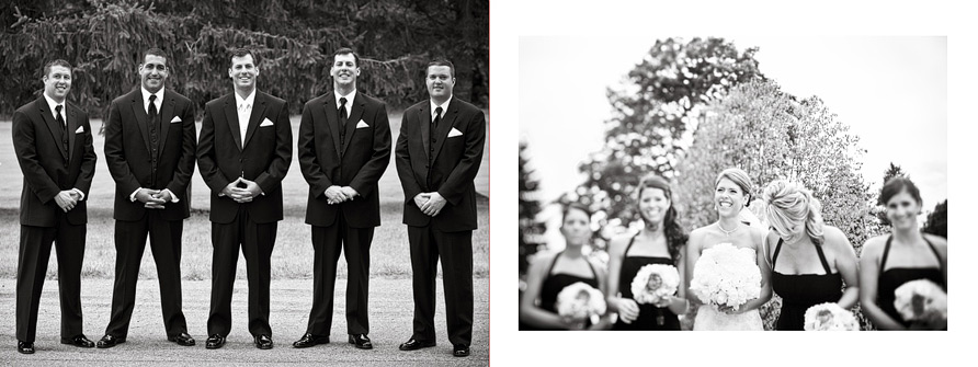
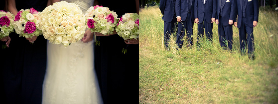
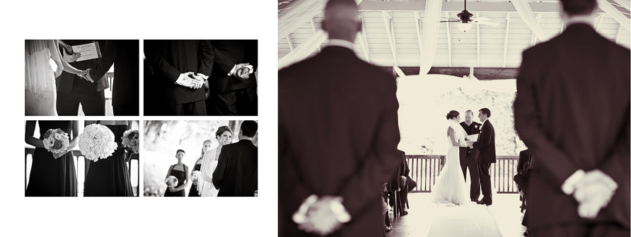
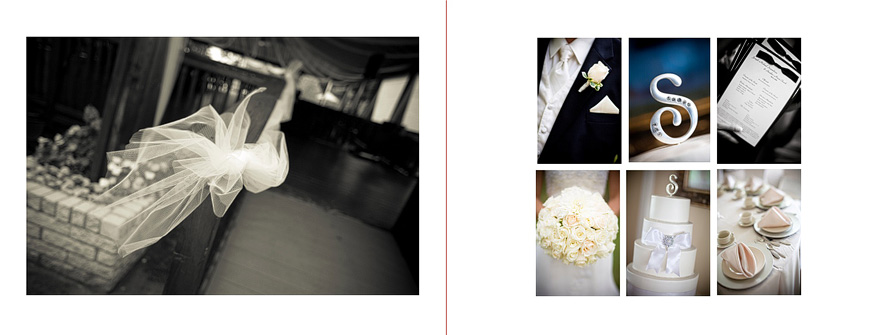
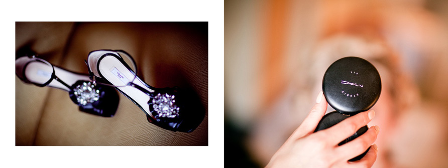
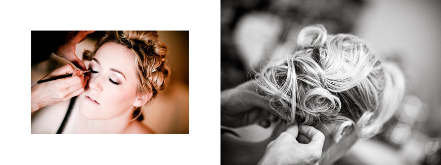
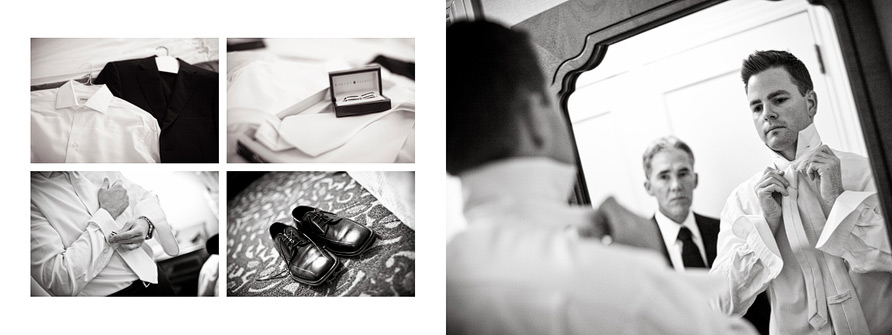
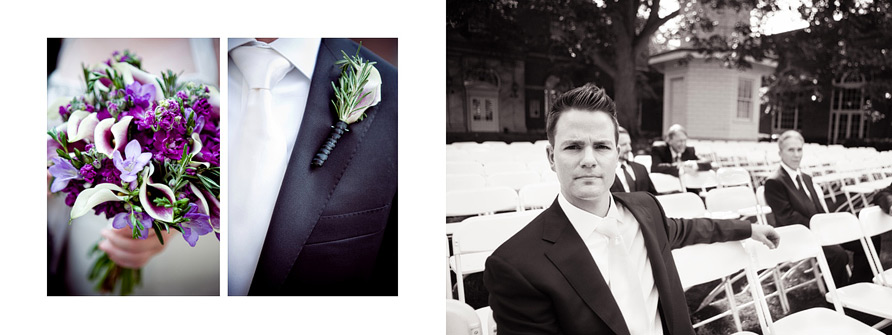
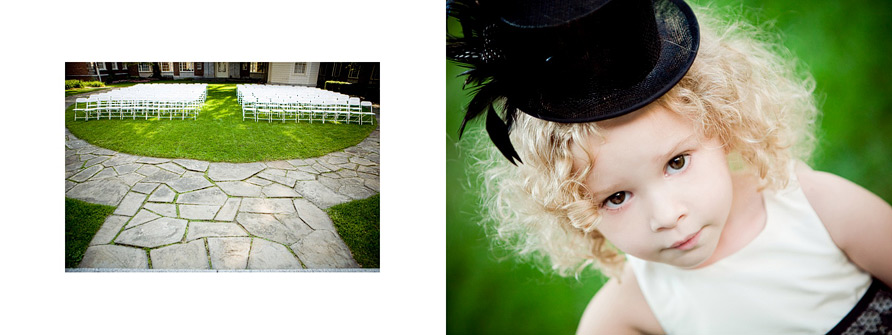
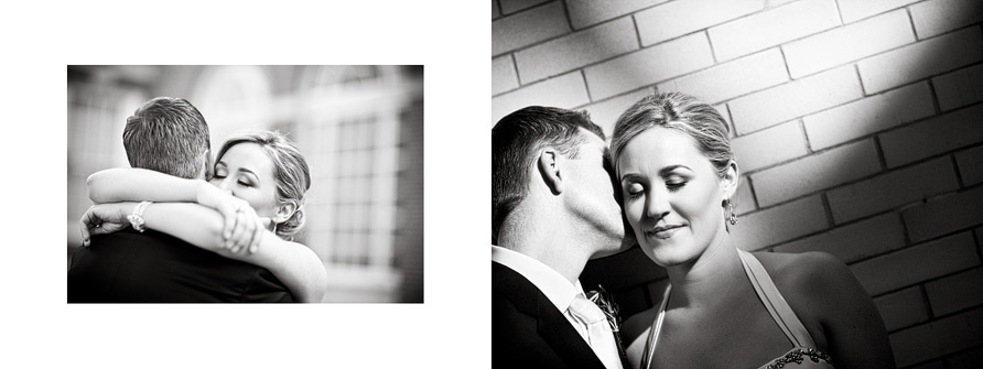
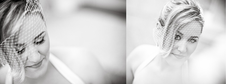
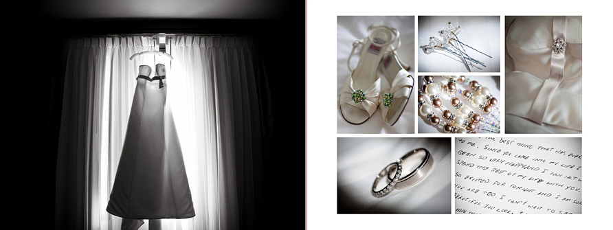
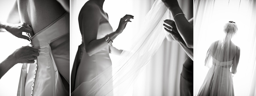
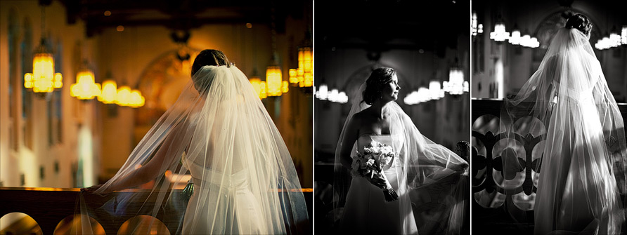
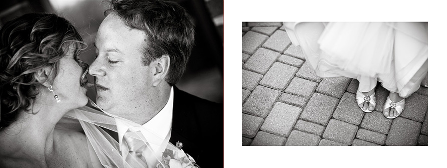
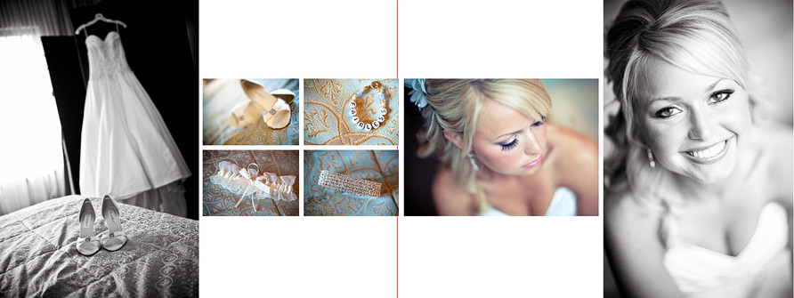
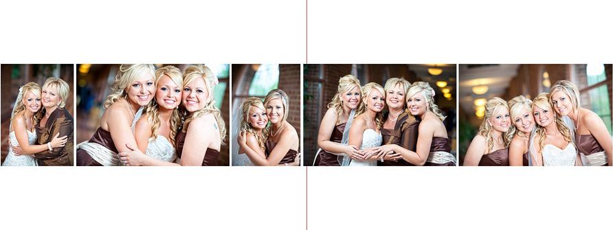
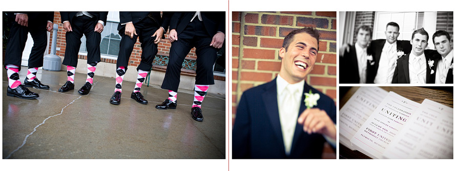
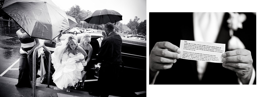
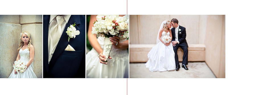
When it comes to album design, my personal philosophy is LESS IS MORE. I am a big fan of clean, simple spreads that feature BIG images. I always really encourage my clients to not feel pressured to cram every last photo they can into their album. But rather, to let me pick the strongest, most beautiful storytelling images, and create a true art book.
some of my favorite layouts from joe and heather’s album: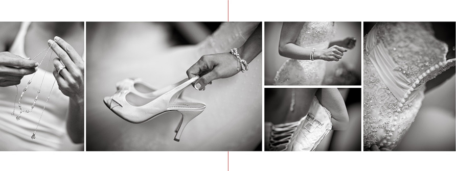
These are gorgeous, Abby! Seems like every one of your brides should have one. 😉
LOVE them! Post more 😉
Love seeing these Abby! I myself and literally in the midst off all my albums and I love designing them 🙂 We have a very similar approach…your designs are clean and timeless and showcase your imagery perfectly. I see you are partial to the 11x14ish ratio and the horizontal…very nice 🙂 Thanks for sharing!
just beautiful! I need to take this approach, I’m soooo tired of jamming everything the clients wants in there. It ends up looking like a proof book, urgh! Hope you are well!